
Understanding color theory in interior design is crucial for creating a cohesive and visually appealing space. Color is one of the most powerful tools in a designer’s toolkit, and it can be used to evoke emotions, set the tone, and create a sense of harmony within a room. However, choosing the right colors can be a daunting task, especially for those who are not familiar with the principles of color theory.
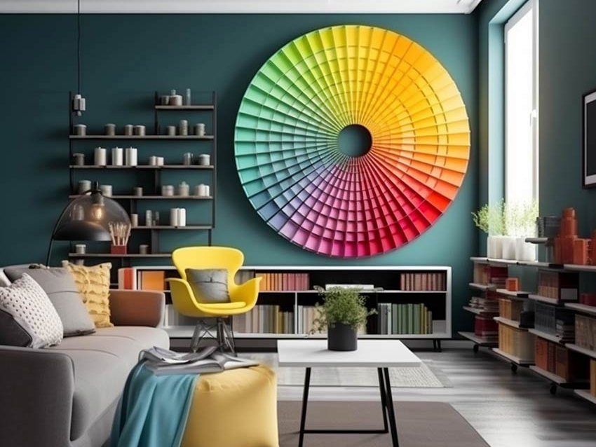
Professionals in the interior design industry know the study of how colors interact with each other and how they affect our emotions and perceptions. It is based on the color wheel, which is a visual representation of the primary, secondary, and tertiary colors.
By understanding the relationships between colors, designers can create color schemes that are balanced, harmonious, and visually appealing. Moreover, color theory can help designers to create a specific mood or atmosphere within a room, such as warmth, calmness, or energy.
Understanding Colors and Their Characteristics Primary, Secondary and Tertiary Colors
In color theory, there are three primary colors: red, blue, and yellow. These colors cannot be created by mixing any other colors together. Secondary colors are created by mixing two primary colors together. The three secondary colors are green (blue + yellow), purple (red + blue), and orange (red + yellow). Tertiary colors are created by mixing a primary color with a secondary color. For example, red-orange is a tertiary color made by mixing red and orange.
Color schemes are created by using a combination of these colors. For example, a monochromatic color scheme uses different shades and tints of the same color. A complementary color scheme uses colors that are opposite each other on the color wheel, such as blue and orange. An analogous color scheme uses colors that are next to each other on the color wheel, such as blue, blue-green, and green.
Characteristics of Colors
Colors have different characteristics that affect how they are perceived. Hue refers to the actual color, such as blue or red. Chroma refers to the intensity or purity of the color. Tint is a color that has been lightened by adding white. Shade is a color that has been darkened by adding black. Tone refers to a color that has been lightened or darkened by adding gray.
Lightness and darkness refer to how light or dark a color is. Colors can also have different color temperatures, which affect how warm or cool they appear. Warm colors, such as red, orange, and yellow, have a higher color temperature and are associated with energy and excitement. Cool colors, such as blue, green, and purple, have a lower color temperature and are associated with calmness and relaxation.
Color Harmonies and Schemes
Color schemes are an essential part of interior design, and understanding color harmonies is crucial to create a cohesive and aesthetically pleasing space. A color harmony is a combination of colors that are visually appealing and work well together. There are various color harmonies and schemes that designers use to create a balanced and harmonious interior.
Basic Color Schemes
The basic color schemes are the foundation of color theory in interior design. These color schemes include complementary, analogous, and triadic color schemes.
- Complementary Color Scheme: This color scheme uses two colors that are opposite each other on the color wheel, such as red and green. The complementary color scheme creates a high contrast and is perfect for creating a dramatic effect in a room.
- Analogous Color Scheme: This color scheme uses colors that are adjacent to each other on the color wheel, such as blue and green. The analogous color scheme creates a harmonious and calming effect in a room.
- Triadic Color Scheme: This color scheme uses three colors that are evenly spaced on the color wheel, such as red, yellow, and blue. The triadic color scheme creates a vibrant and energetic effect in a room.
Advanced Color Schemes
The advanced color schemes are more complex and include tetradic, monochromatic, and split-complementary color schemes.
- Tetradic Color Scheme: This color scheme uses four colors that are evenly spaced on the color wheel, such as red, yellow, green, and blue. The tetradic color scheme creates a bold and dynamic effect in a room.
- Monochromatic Color Scheme: This color scheme uses variations of a single color, such as light blue, blue, and navy blue. The monochromatic color scheme creates a serene and sophisticated effect in a room.
- Split-Complementary Color Scheme: This color scheme uses one color and two colors that are adjacent to its complementary color, such as blue, orange, and yellow-orange. The split-complementary color scheme creates a balanced and harmonious effect in a room.
Conclusion
Understanding color theory is vital for interior designers to create visually appealing and emotionally resonant environments. It involves principles of color mixing, subtractive color mixing model, and color variations to create harmonious color schemes. Cool colors induce a calming atmosphere, warm colors stimulate energy, while neutral colors provide a timeless appeal.
Understanding tones and undertones is crucial for color selection and context creation. Contrast enhances visual interest and perception of space, while consideration of light conditions affects color perception. Thus, color theory is a key tool in interior design for creating aesthetically pleasing and functional spaces.
See Also – Who Is Mr Beast Wife, And Is Chris Tyson Divorced?